Show Your Stripes
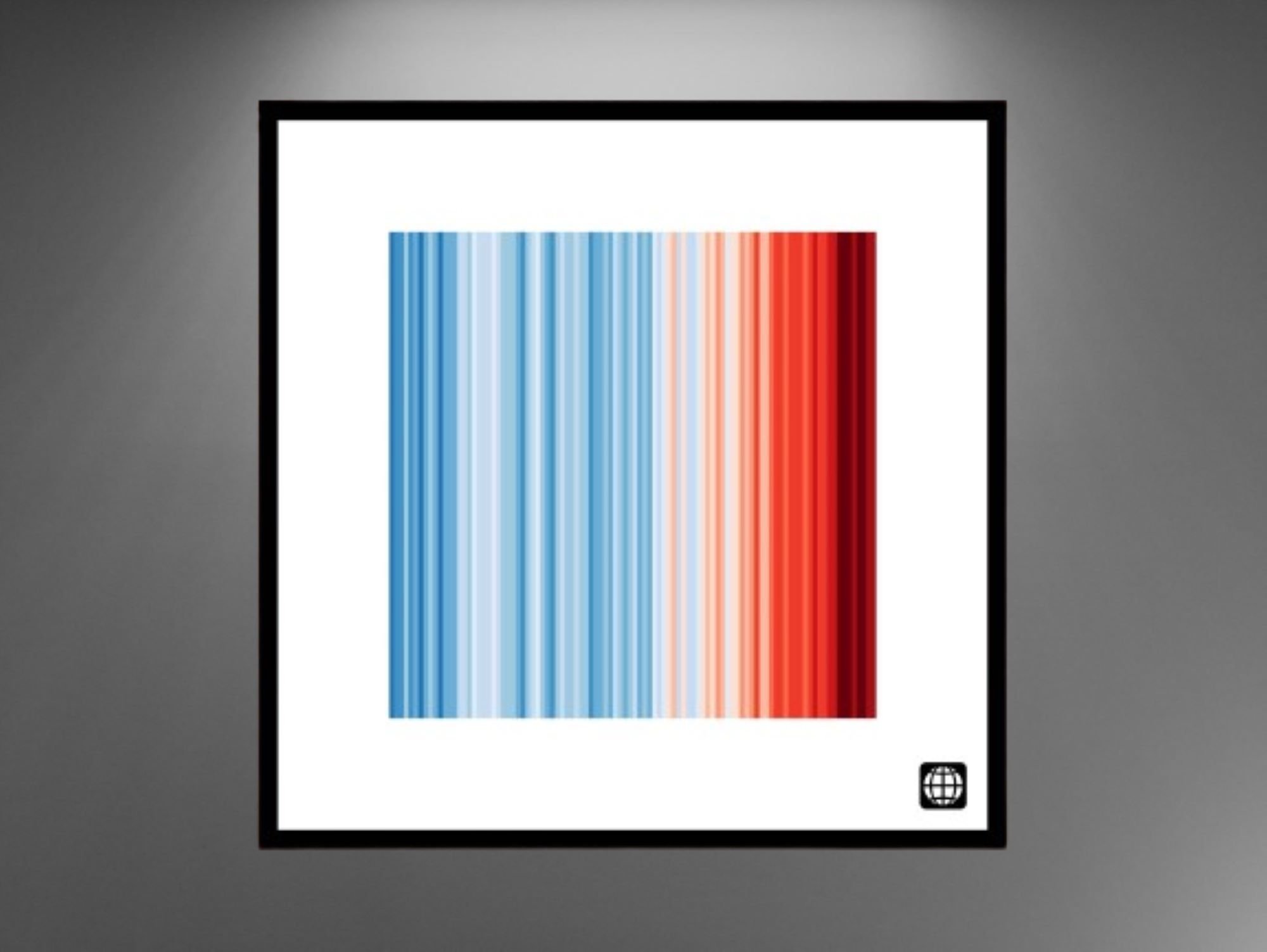
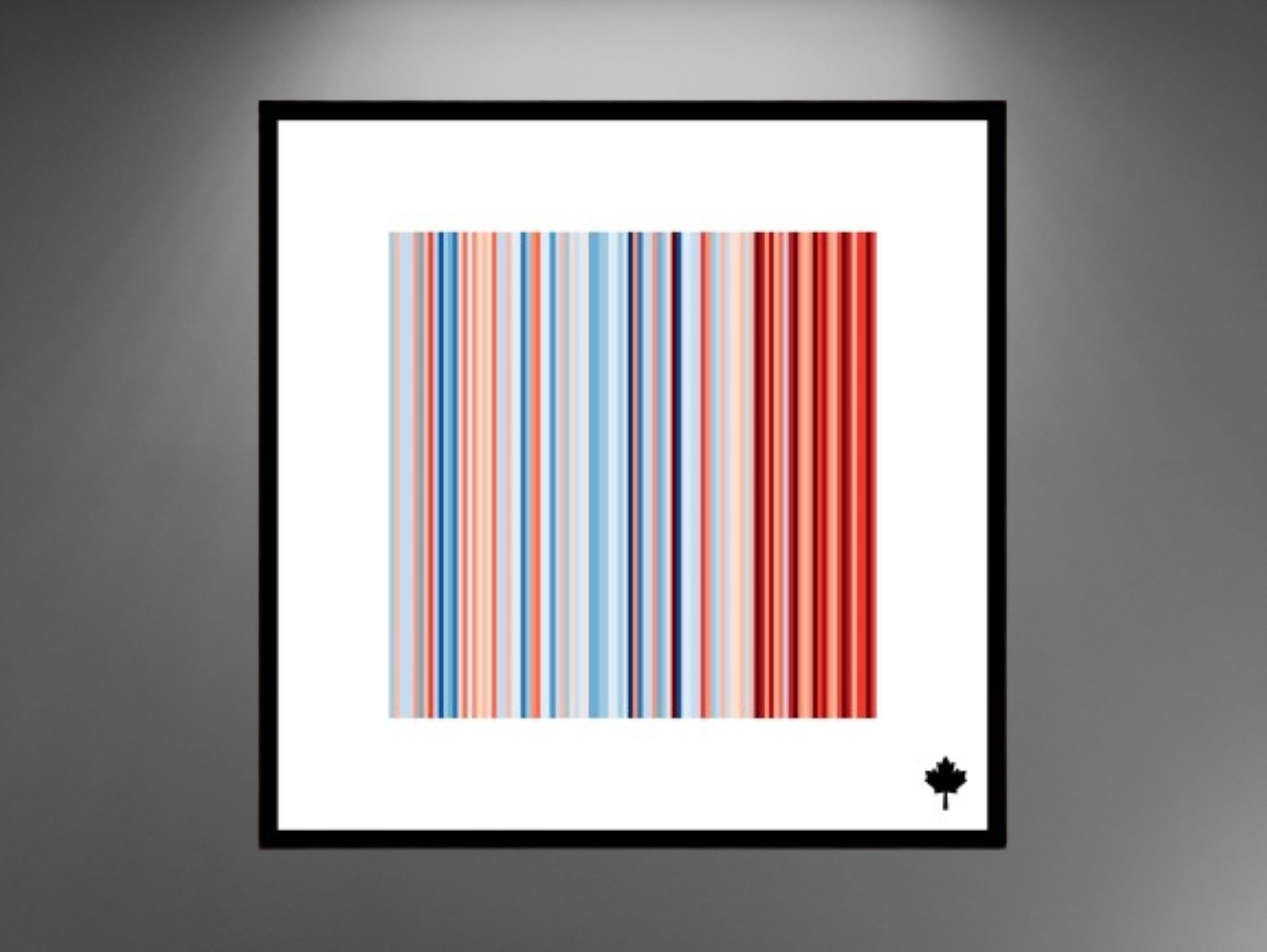
These “warming stripe” graphics are visual representations of the change in temperature measured in Manitoba, in Canada or globally over the past 100 years. Each stripe represents the temperature in a region averaged for each year. The stripes start in 1923 and finish in 2022.
The stripes are designed to be as simple as possible, to start conversations about our world warming and the risks of climate change. The stripes turn from blue to mainly red in more recent years, illustrating the rise in average temperature.

GLOBAL

CANADA

MANITOBA
